This article is part of our pool builder branding: a guide to premium positioning. Start with the full guide for the complete process, then use this article to work through one decision.
Plan a pool company logo suite that works across your website, social profiles, vehicles, signs and uniforms with clear production standards.
A premium pool building firm operates in two vastly different environments: the high-stakes digital world where affluent clients discover their work, and the harsh, physical reality of the construction site.
When a custom builder tries to represent their brand using a single, rigid logo, they introduce immediate operational friction.
A logo designed solely for a desktop website header will fail when embroidered onto a field manager's polo shirt, stenciled onto a heavy excavator, or compressed into a smartphone favicon. In the luxury segment, inconsistent or unreadable branding suggests a lack of operational discipline.
Protecting your margins requires an integrated design system. You need a responsive logo suite that maintains its clarity, authority, and visual balance across every physical and digital medium.
1. A Versatile Logo Suite Capable of Scaling Across Heavy Machinery and Fleet Vehicles
Custom pool builders utilize heavy, high-capital assets daily. Your dump trucks, service flatbeds, and excavators are mobile billboards parked in front of multi-million dollar estates. If your brand mark is too delicate or contains intricate script lettering, it becomes an illegible blur to passing traffic.
A premium design system relies on a responsive logo suite. This framework includes several distinct variations of your brand mark, each optimized for specific dimensions and materials:
- The Primary Mark: This is your most comprehensive asset, displaying your full business name and signature icon. Use this for main office signage, client proposals, and large-scale vehicle wraps where space is abundant.
- The Horizontal Wordmark: This version strips away vertical icon arrangements, aligning your company name on a single horizontal plane. It is engineered for the narrow sides of trailers, truck tailgates, and structural beams.
- The Submark / Monogram: This is a highly simplified, compact symbol representing the core of your brand. It is designed for small-scale physical applications: safety helmets, worker apparel, equipment stencils, and custom-embossed leather presentation folders.
By establishing these variations, you ensure that your brand looks intentional and highly organized, whether it is displayed on a massive steel trailer or stitched onto a canvas field jacket.
2. Less Is More: Avoiding Gold and Metal Textures
A simulated metallic effect may be difficult to reproduce consistently on signs, uniforms and small icons. Evaluate the mark in flat color and monochrome before relying on a gradient.
Real luxury brands build authority through geometric precision, generous spatial margins, and solid colors.
Simulated metallic textures present massive production challenges. A gold gradient requires a complex print process to look correct on paper. When you attempt to replicate that gradient on other materials, the brand identity breaks down completely:
- Embroidered shirts look like they have messy yellow or brown threads instead of gold.
- Stenciled equipment logos lose their depth, appearing as flat, muddy shapes.
- Sandblasted concrete or etched glass signs cannot reproduce the digital shine, leaving the mark unrecognizable.
True premium positioning relies on solid, flat vector graphics. If your logo design is structurally sound, it does not need a fake metallic texture to look expensive. The luxury feel comes from the balance of the shapes, the weight of the lines, and the surrounding whitespace.
3. Maintaining Digital Adaptability for Favicons and Mobile Profiles
Modern high-value clients research home investments on their mobile devices. They view your work on small screens, scrolling through social media, reading digital portfolios, and reviewing proposals via email.
If your primary logo is a complex architectural crest with multiple lines of small text, it will compress into a dark, illegible smudge in a digital environment.
Your digital touchpoints require strict optimization:
- The Favicon: A browser icon may appear at very small sizes, including 16 by 16 pixels. Provide a simple mark and suitable image sizes so it remains recognizable across browser and device contexts.
- Mobile App Icons and Social Profiles: Circular profile containers crop the corners of rectangular layouts. Your design system must include a dedicated circular or square submark that sits perfectly inside these digital profiles without cutting off your business name.
- Email Signatures and PDF Headers: These areas require low-height, horizontal assets. Using a tall, vertical logo forces the user to scroll unnecessarily, disrupting the clean layout of your digital communications.
Design your digital assets with a mobile-first perspective. When your digital marks scale down cleanly without losing their definition, you signal to affluent clients that your business operates with modern, high-level attention to detail.
4. Protecting Brand Identity with High-Contrast and Monochrome Standards
A truly functional logo system must perform under the worst possible visual conditions. Your brand marks will be printed on low-grade paper permits, copied on black-and-white office machines, laser-etched onto metal equipment plates, and stamped into raw concrete.
To check its versatility, test each asset in your logo suite in monochrome:
- Design every brand mark in solid black and white before introducing a single color. If your logo requires a specific color gradient to be readable, the underlying geometry is weak.
- Ensure the spacing between design elements is wide enough to prevent bleeding. When a logo is embroidered or printed at small sizes, tight spaces fill with ink or thread, destroying the details.
- Establish a strict reverse-contrast standard. Your system must include a dedicated light version of the logo optimized for dark backgrounds, ensuring the lines do not look unnaturally thick or distorted when reversed.
When you enforce these high-contrast standards, your brand maintains its professional edge across all physical applications, from high-end presentation binders to muddy job-site signs.
5. Evoking Luxury Buyer Triggers Through Typography and Strategic Color Palettes
Typography and color contribute to an impression, but they do not reliably reveal a buyer’s wealth or determine what a customer will pay.
Choose type and color for the company’s personality, readability and production needs. Bright colors and bold fonts can work well when used consistently.
To attract six-figure projects, your typography and color selections must reflect architectural heritage and permanence:
- Typography: Choose readable typefaces with appropriate weights and spacing. Tracking controls spacing across a run of text; kerning adjusts the space between particular character pairs.
- Color Palettes: Build a focused palette that supports your identity, contrast and real-world applications. Restrained earth tones are one option, not a requirement for premium positioning.
Your visual assets should look like they belong to a premier architectural studio rather than a standard commercial utility company. This subtle shift in styling changes how clients value your advice, allowing you to maintain firm pricing structures.
6. Verifying Commercial Font Licensing to Prevent Future Legal Friction
Font licenses differ. Before using a typeface commercially, check the license supplied by the foundry or provider for the intended desktop, web, app and vendor uses.
As your business grows in local prominence, your visibility increases:
- Confirm the permitted uses and any limits on sharing font files, embedding or web traffic.
- Keep license records and give vendors access only as permitted by those terms.
- Proper licensing protects your corporate assets and preserves your clean reputation in the local business community.
Choose a license that covers your intended uses. Some fonts are available under open licenses; others require a purchase or subscription. Licensing and web performance are separate checks.
FAQs
Why can we not just have one single logo for our entire business?
A single logo cannot adapt to the diverse environments of a premium pool building business. A layout that looks balanced on a wide horizontal truck tailgate will become completely illegible when forced into a small, square Instagram profile or a tiny website favicon. A responsive logo suite provides optimized variations for every shape and size, preserving your professional image across all applications.
We already have a logo with a gold gradient. Do we need to throw it away?
You do not need to abandon your existing brand concept, but you must optimize it. You can convert your gold-gradient logo into a solid, flat-color vector asset (such as a refined champagne-gold or warm sand tone). This preserves your brand recognition while making the logo functional for physical production methods like embroidery, stenciling, and high-contrast printing.
How do we know if our current logo looks too much like a cheap contractor?
Review legibility, distinctiveness, consistency and how the mark works at real production sizes. Color alone does not make a brand cheap or premium. Test the system beside your website, project photography and physical materials.
Securing Your Visual Authority
Creating custom, highly engineered outdoor living environments is an elite architectural service. If your visual branding resembles a basic local installation company, you will struggle to convince affluent clients to pay a premium for your work.
We partner with high-end design-build firms to build cohesive brand systems, responsive logo suites, and comprehensive style guides. Together, we can align your physical presentation with your engineering standards, protecting your margins and establishing your business as the premier authority in your market.
Continue your reading
- What Belongs in a Pool Builder Brand Style Guide?
- A Better Brand-to-Website Handoff for Pool Builders
See the strategy in practice
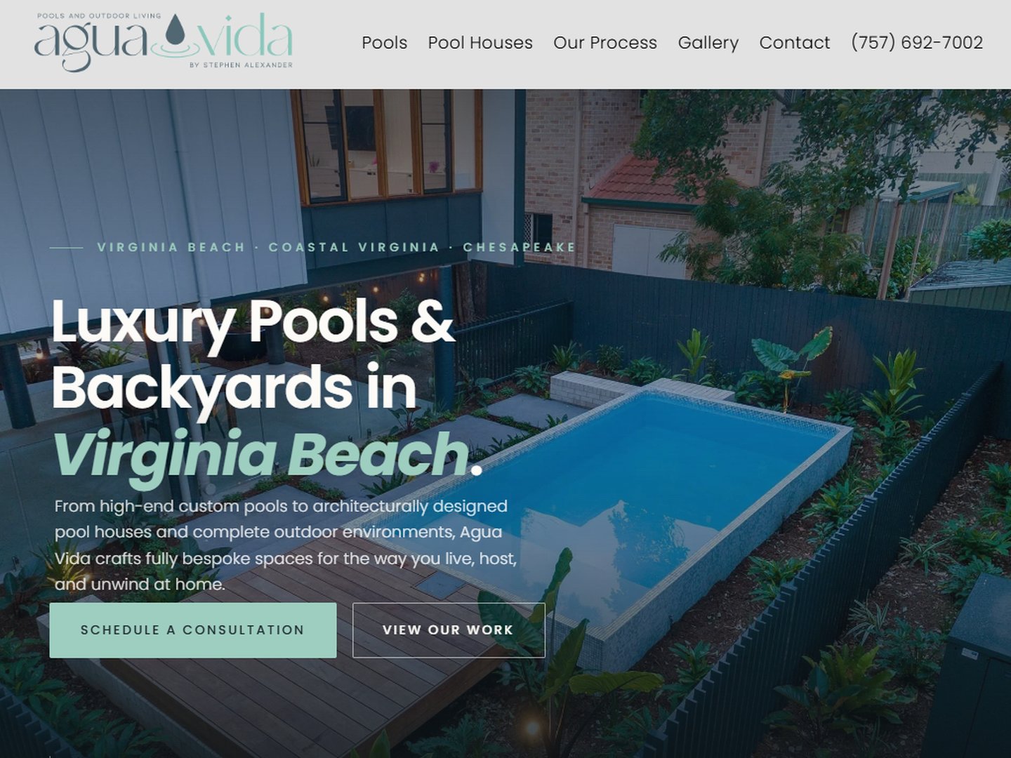
Explore the Agua Vida Pools & Outdoor Living case study for a documented Bryant Digital project. The case study explains its own scope and reported outcomes; it is not a projection for another business.
For help applying this work, review our brand positioning for pool builders and the Market Leader System, or explore all pool builder marketing resources.