This article is part of our pool builder branding: a guide to premium positioning. Start with the full guide for the complete process, then use this article to work through one decision.
Document your pool company’s logo rules, colors, typography and photography so staff and vendors can apply the brand consistently.
A custom builder spends years earning a local reputation for flawless engineering and precise execution. Yet, that hard-earned regional authority can vanish through minor, unmonitored compromises in daily marketing. A local sign contractor stretches your logo to fit a new flatbed tailgate. A screen-printer uses a standard royal blue because no one provided the specific color code. A field superintendent posts a project photo on social media using an unapproved font.
These small deviations accumulate. To a property owner preparing to invest 250,000 dollars in a luxury outdoor living project, these visual inconsistencies signal an operational weakness.
Affluent clients link visual organization directly with technical capability. If a construction firm cannot manage its public appearance, clients assume the team lacks the discipline to manage complex soil elevations, hydraulic flow rates, and strict project timelines.
Establishing an operational brand rulebook eliminates this structural risk. A definitive style guide protects your marketing capital, preserves your profit margins, and secures your position as a regional authority across every physical and digital touchpoint.
1. How Visual Consistency Supports Premium Positioning
In the luxury custom building sector, your brand must communicate absolute precision. High-net-worth buyers possess a trained eye for design balance. They navigate spaces built by leading architects and designers, recognizing professional execution immediately.
When your brand elements look mismatched or crowded across different media, you introduce immediate friction into the sales process.
A prospect reviews a highly detailed, leather-bound contract proposal on their desk. Later that afternoon, they spot your utility truck bearing a distorted, off-color decal. This contrast creates an immediate psychological barrier. The client begins to question whether your premium pricing reflects real structural mastery or simply a temporary marketing veneer.
Visual cohesion removes this sales barrier. When your vehicles, apparel, site signage, and digital communications maintain a uniform, highly disciplined presentation, you reinforce your authority. You demonstrate that your standards apply to every business operation, from structural concrete engineering to the embroidery on your field uniforms.
2. Enforcing Spatial Guidelines to Prevent Logo Stretching and Crowding
The physical application of brand marks is a major risk area. Sign writers, apparel decorators, and digital publishers work under tight timelines. Without explicit rules, they manipulate graphics to fit available spaces, stretching letters or squeezing icons to meet a margin.
This distortion ruins the geometric balance of your mark, making it look amateurish. Your style guide must establish clear, non-negotiable rules for logo preservation:
- Clear Space Requirements: Define a specific boundary around your logo where no other text, images, or layout margins can enter. This margin scales with the logo, ensuring your emblem always has adequate breathing room.
- Prohibited Distortions: Detail a visual index of forbidden modifications. Ban vertical stretching, horizontal compression, unauthorized gradients, and tight borders.
- Minimum Dimensions: Set strict minimum sizes for both print and digital versions of your logo. This prevents your business name from turning into an illegible blur on small assets like safety glasses, vehicle decals, or website footers.
These spatial constraints remove guesswork from physical production, forcing external vendors to respect the geometric integrity of your brand.
3. Locking in Print and Digital Color Codes for Uniform Presentation
Color shifting destroys brand recognition. A slate gray that looks refined on a smartphone screen can easily turn a cold, industrial blue on a vehicle wrap, or look muddy when stitched onto a cotton polo. If your brand colors vary from site to site, your firm looks disorganized.
To maintain a flawless, unified presentation, your style guide must define exact color formulas for every production environment:
- HEX Codes: These six-character codes are mandatory for all digital layouts, including your website, email newsletters, and interactive proposals.
- RGB Values: Specify screen color values, then check contrast and appearance on representative displays.
- CMYK Formulas: These coordinates are required for physical printing, including stationery, project portfolios, and brochures.
- Spot-Color References: Where relevant, provide an agreed reference and confirm what the sign, print or apparel vendor can reproduce on the chosen material.
Specifications reduce guesswork, but screens, inks, fabrics and lighting can still differ. Review proofs and physical samples before a major production run.
4. Establishing Visual Guardrails to Actively Protect Long-Term Brand Equity
As your premium pool building company expands, you will work with multiple external partners, including web developers, videographers, and advertising specialists. These creative professionals often apply their own stylistic preferences to your brand. Without clear guidelines, they can slowly pull your business away from its premium positioning.
An operational style guide sets strict visual boundaries that protect your long-term brand equity:
- Approved Palettes: Establish a clean, limited matrix showing which background colors can pair with your logo variants, preventing unreadable or unprofessional combinations.
- Typographic Standards: Select two or three commercial fonts for all company documents. Define which weight and letter-spacing are required for main headings, secondary subheads, and body copy.
- Photography Protocols: Specify the exact style of photography allowed to represent your work. Ban the use of cheap stock photos, aggressive color filters, or low-resolution snapshots. Mandate high-resolution architectural photography that emphasizes structural integration, raw material textures, and natural lighting.
These guardrails preserve your marketing capital, focusing your creative investments on assets that build deep, compounding value in your local market.
5. Utilizing Style Guides as the Operational Rulebook for Staff and External Vendors
A style guide is not a decorative document meant to sit in an archive. It functions as an active operational manual, integrated directly into your employee onboarding and trade partner agreements.
When you hire a new web designer, apparel vendor, or sign maker, your brand rulebook must be the first document you deliver.
This professional handoff establishes clear terms from the beginning. It saves valuable administrative hours spent correcting mistakes, protects your budget from wasted print runs, and empowers your office staff with a precise checklist to review and approve materials before they are finalized.
Treating your style guide as a strict operational standard builds a protective wall around your business. You stop wasting time on careless execution and start building a unified, highly polished regional presence.
FAQs
We are a highly specialized boutique builder. Is a style guide really necessary for us?
A concise style guide is useful whenever several people or vendors create materials. Start with the rules and assets your team actually needs, then expand it as applications grow.
What if a local vendor refuses to use our exact Pantone color formulas?
Ask the vendor which color-matching process works for the material and request a sample. Exact matching is not possible in every process, so agree on an acceptable result before production.
How frequently should we update our brand style guide?
Review it when new applications expose gaps and whenever the brand changes. Keep a dated current version and archive older files so staff know which rules apply.
Securing Your Regional Authority
Creating custom architectural pools is a demanding, high-risk discipline requiring precision engineering and deep management skills. If your visual presentation is disorganized, you actively degrade the perceived value of your craftsmanship.
We partner with custom design-build firms to build robust brand assets, definitive style guides, and operational standards that attract qualified buyers. Together, we can align your brand presentation with your physical craftsmanship, protect your pricing power, and position your firm as a credible specialist in your market.
Continue your reading
- A Better Brand-to-Website Handoff for Pool Builders
- Making a Pool Builder Rebrand Work Across Your Team
See the strategy in practice
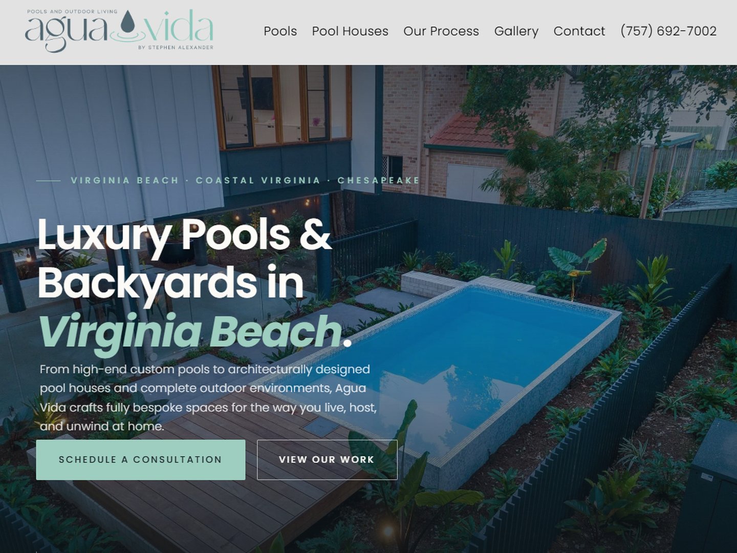
Explore the Agua Vida Pools & Outdoor Living case study for a documented Bryant Digital project. The case study explains its own scope and reported outcomes; it is not a projection for another business.
For help applying this work, review our brand positioning for pool builders and the Market Leader System, or explore all pool builder marketing resources.